Friday, November 19, 2010
Global Warming Updated
 Over on the discussion list I'm on, Science Matters, a "discussion" has broken out about global warming. A correspondent has posted an graph of satellite data claiming that
a) the satellite records are more reliable than ground records
b) the "trendlines" show the world is cooling and
c) the dip cannot be explained as a statistical anomaly.
Unfortunately for our correspondent, the data he showed ended in 2008, and there is much more recent data that falsifies his claims. The graph on the left is the most recent satellite data from the University of Alabama at Hunstville (UAH lower troposphere data here, middle troposphere data here).
 I've plotted the raw data (dots), the linear fit (black line), the 5 year rolling average (red line) and a polynomial fit (colour I can't describe because I'm red-green colour blind). I've also done the same plot with one year averages, rather than raw data (here the polynomial fit is the blue line). You can click on all images to embiggen.
You can see immediately that the temperature is not falling, but relentlessly increasing. Indeed the increase from the UAH satellite data (0.14 degrees per decade), is very similar to the ground based increase (0.18 degrees per decade) and the RSS satellite data (0.17 degrees per decade).
You can use the data plotter at Wood for the Trees to overlay the latest ground and satellite data, an overlay with trendlines is here.
I've also indicated on the raw data graph some major climatic events; volcanic eruptions (Pintabo, El Chichon) and El Nino and La Nina events. 2008 was a strong La Nina event which produced a temporary downswing. The downswing in 2008 was not a statistical blip, but a well understood temporary effect of the La Nina/El Nino phenomena. in contrast 2009 tied for the hottest year on record in the land based data set, and 2010 looks to be not far behind.


Left image, my plot of middle troposphere temperatures to October 2010, the blue line is the polynomial fit zooming upwards, right image, the plot of middle troposphere temperatures to mid 2008, the polynomial (NOT a trend), zooms down. This is why you don't trust polynomial fits
One amusing effect is what happens to the polynomial fit. The correspondent claimed the "trendline" showed a downward swing, but its a polynomial fit, not a trendline. As I've written before polynomial fits are very misleading, because they exaggerate end effects (see also here). With the most recent data, the polynomial fit skyrockets, by our correspondents logic, we are in for sustained catastrophic warming.
 Image credit Real Climate. Showing how the satellite record of temperatures follows the surface temperatures.
As well, the correspondent sees satellite data as more reliable than surface station temperature records, the surface station records are infact pretty good. Satellite measurements have a wide variety of problems of their own, from reconciling different satellite instrumentation, to changing orbits, to instrumental calibration to the fact the sensors peer through a cooling stratosphere. This compendious (and very large 145 page) paper gives a long list of the calibration problems and their attempted resolution.
The main points are that satellite data confirms the land based data and it's not "better".
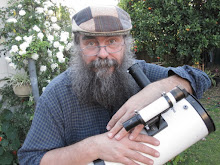
 Monthly September ice extent for 1979 to 2010 shows a decline of 11.5% per decade.
 —Credit: National Snow and Ice Data Center
High-resolution image
Look, global warming is real, and largely due to human actions. Years-out-of-date graphs with dodgy curve fits won't change that.
Good backgrounds to the whole global warming thing are at http://www.realclimate.org/ and Brave New Climate http://bravenewclimate.com/. See also The Copenhagen Diagnosis for a simple and clear explanation.
The major issues are comprehensively covered at http://scienceblogs.com/illconsidered/2008/07/how_to_talk_to_a_sceptic.php , see also New Scientist's Climate Change a Guide for the Perplexed and Climate Change myths. If you are not happy with NASA or the IPCC how about Australia's own flagship research organisation, the CSIRO. The advice of the CSIRO that the world is warming, with humans largely responsible.
And please don't try and rabbit on about climategate, I won't enter into any correspondence about that as it's a nontroversy with the CRU exonerated. See this article on the one year anniversary of the CRU hack and this one. It was all an egregious beat-up. (Oh yeah, and there is this post on alleged IPCC "errors"). Oh, and a list of publicly accessible data sources for climate data and code is here, this is the stuff that "skeptics" keep saying hasn't been released.
My list of climate change posts is here.
Labels: global warming sillyness
# posted by Ian Musgrave @ 8:39 pm 
![]()

 Click to read about or order
 Click to read about or order
 Click to read about or order
 Click to read about or order


