Sunday, July 22, 2012
Support Michael Mann (and other climate scientists)

Climate scientists in particular have borne the brunt of those who feel threatened by reality. Michael Mann in particular has borne the brunt of many of these attacks, as he produced some iconic research the "hockey stick" which has clearly illustrated the unusual nature of recent warming.
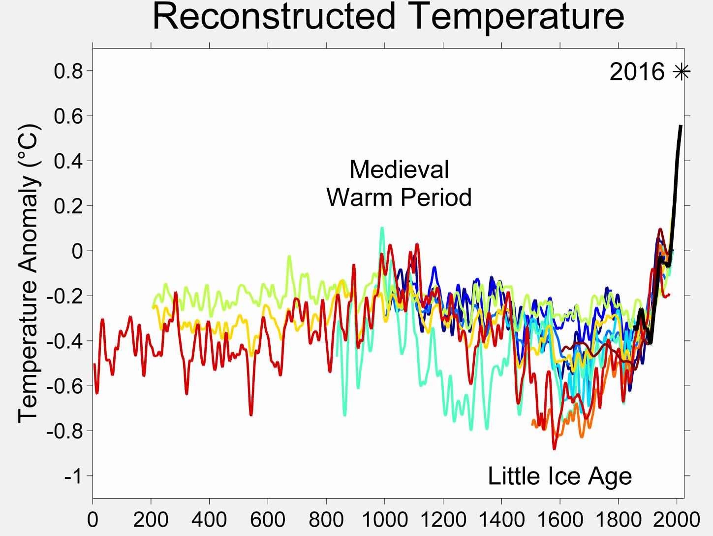
He's had to put up with people claiming his research was fraudulent for a long time, despite it being independently replicated by many others (see diagram above). Well, he's finally striking back, yet another correspondent has publicly accused him of doing fraudulent research in print.
Now, the "Hockey Stick" is not fraudulent. This discussion of the "Hockey Stick" goes into much better detail about it (actually, it gets a bit technical), but the take home message is that the results are well validated, reproducible in other studies and most importantly, the statistical treatment (it wasn't a "mathematical formula as most lay people would understand) did not automatically generate "hockey sticks" (It was principle component analysis for crying out loud). See also this discussion of "Hockey Stick" myths.
Anyway, he has, through his lawyers, issued a letter asking for removal of the article and a public apology. Good on you Michael, let's hope you get the apology.
If you are interested in helping climate scientists defend themselves for the numerous attacks on them, you might consider contributing to the Climate Science Legal Defence Fund.
Labels: Climate Change, global warming sillyness

Saturday, October 29, 2011
When an Eminent Historian Writes on the History of Science it Would be Nice ....
"In 1970 the overwhelming majority of scientists believed that there was not going to be going to be global warming over the next 40 years..."
If he had bothered to do any research, rather than buying into denialist myths, he would have found that most research was pointing to warming, and that warming was a long-standing prediction of physics (see also this article).
Blainey goes on to say:
"The interesting thing to me about science is that it's given the benefit of of the doubt in ways that Christianity used to be given the benefit of the doubt."
Well, if it were true, that would because science has runs on the board in way that religion hasn't. From the eradication of small pox to landing people on the Moon, science has proved its credentials. Whenever you use your mobile phone, you are using the practical application of quantum mechanics and the theory of relativity. Religion ascribed epilepsy to demonic possession, a few Christian sects still do, with tragic consequences. But science is unravelling the causes of epilepsy and has developed effective treatments. So science has earned the benefit of doubt.
But in fact, science rarely is given the benefit of the doubt. From global warming, to tobacco and cancer, to acid rain, to heart transplants, to IVF, to the ozone hole, to collapse of fish stocks from overfishing politicians, entrenched interests and often religious leaders have fought tooth and nail against the scientific consensus, only relenting (sometimes) when scientists have been shown incontrovertibly, sometimes tragically, right. Between The Australians War on Science and members of the Catholic Church spreading misinformation on condoms and AIDS, it's obvious that science isn't being given the benefit of the doubt and is being actively opposed.
Blainey has written some wonderful history, his "Tyranny of Distance" was a seminal work of Australian history, it's a pity his comments on science are fantasy.
Labels: global warming sillyness, history, scepticism, science communicators
Friday, November 19, 2010
Global Warming Updated
 Over on the discussion list I'm on, Science Matters, a "discussion" has broken out about global warming. A correspondent has posted an graph of satellite data claiming that
a) the satellite records are more reliable than ground records
b) the "trendlines" show the world is cooling and
c) the dip cannot be explained as a statistical anomaly.
Unfortunately for our correspondent, the data he showed ended in 2008, and there is much more recent data that falsifies his claims. The graph on the left is the most recent satellite data from the University of Alabama at Hunstville (UAH lower troposphere data here, middle troposphere data here).
 I've plotted the raw data (dots), the linear fit (black line), the 5 year rolling average (red line) and a polynomial fit (colour I can't describe because I'm red-green colour blind). I've also done the same plot with one year averages, rather than raw data (here the polynomial fit is the blue line). You can click on all images to embiggen.
You can see immediately that the temperature is not falling, but relentlessly increasing. Indeed the increase from the UAH satellite data (0.14 degrees per decade), is very similar to the ground based increase (0.18 degrees per decade) and the RSS satellite data (0.17 degrees per decade).
You can use the data plotter at Wood for the Trees to overlay the latest ground and satellite data, an overlay with trendlines is here.
I've also indicated on the raw data graph some major climatic events; volcanic eruptions (Pintabo, El Chichon) and El Nino and La Nina events. 2008 was a strong La Nina event which produced a temporary downswing. The downswing in 2008 was not a statistical blip, but a well understood temporary effect of the La Nina/El Nino phenomena. in contrast 2009 tied for the hottest year on record in the land based data set, and 2010 looks to be not far behind.


Left image, my plot of middle troposphere temperatures to October 2010, the blue line is the polynomial fit zooming upwards, right image, the plot of middle troposphere temperatures to mid 2008, the polynomial (NOT a trend), zooms down. This is why you don't trust polynomial fits
One amusing effect is what happens to the polynomial fit. The correspondent claimed the "trendline" showed a downward swing, but its a polynomial fit, not a trendline. As I've written before polynomial fits are very misleading, because they exaggerate end effects (see also here). With the most recent data, the polynomial fit skyrockets, by our correspondents logic, we are in for sustained catastrophic warming.
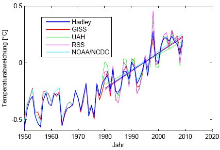 Image credit Real Climate. Showing how the satellite record of temperatures follows the surface temperatures.
As well, the correspondent sees satellite data as more reliable than surface station temperature records, the surface station records are infact pretty good. Satellite measurements have a wide variety of problems of their own, from reconciling different satellite instrumentation, to changing orbits, to instrumental calibration to the fact the sensors peer through a cooling stratosphere. This compendious (and very large 145 page) paper gives a long list of the calibration problems and their attempted resolution.
The main points are that satellite data confirms the land based data and it's not "better".
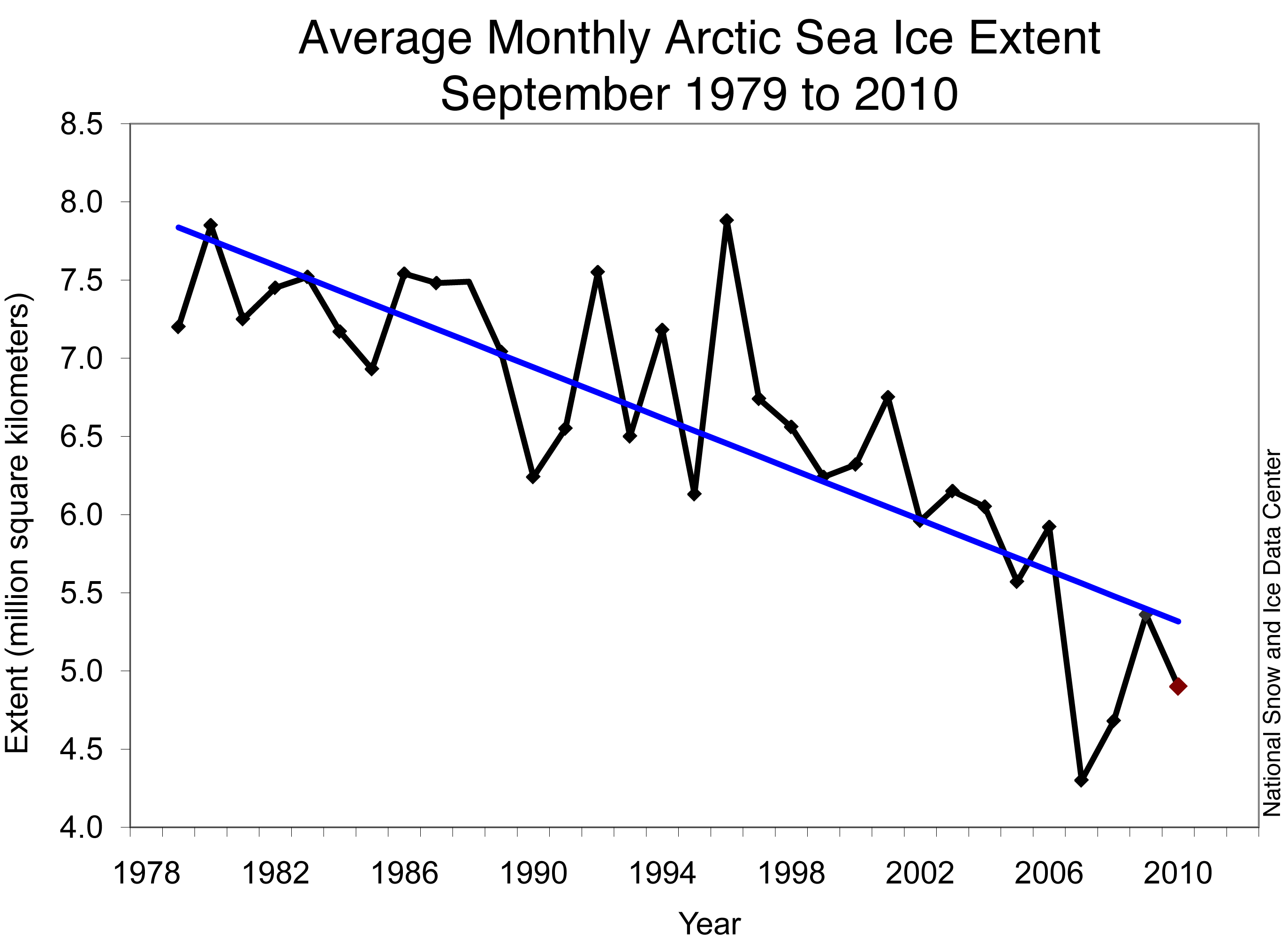 Monthly September ice extent for 1979 to 2010 shows a decline of 11.5% per decade.
 —Credit: National Snow and Ice Data Center
High-resolution image
Look, global warming is real, and largely due to human actions. Years-out-of-date graphs with dodgy curve fits won't change that.
Good backgrounds to the whole global warming thing are at http://www.realclimate.org/ and Brave New Climate http://bravenewclimate.com/. See also The Copenhagen Diagnosis for a simple and clear explanation.
The major issues are comprehensively covered at http://scienceblogs.com/illconsidered/2008/07/how_to_talk_to_a_sceptic.php , see also New Scientist's Climate Change a Guide for the Perplexed and Climate Change myths. If you are not happy with NASA or the IPCC how about Australia's own flagship research organisation, the CSIRO. The advice of the CSIRO that the world is warming, with humans largely responsible.
And please don't try and rabbit on about climategate, I won't enter into any correspondence about that as it's a nontroversy with the CRU exonerated. See this article on the one year anniversary of the CRU hack and this one. It was all an egregious beat-up. (Oh yeah, and there is this post on alleged IPCC "errors"). Oh, and a list of publicly accessible data sources for climate data and code is here, this is the stuff that "skeptics" keep saying hasn't been released.
My list of climate change posts is here.
Labels: global warming sillyness
Monday, August 23, 2010
My Seminar With Ian Plimer


Professor Ian Plimer, one of Australia’s leading Climate Change Inactivists, gave a talk at my School today. Professor Plimer has written a book about global warming, “Heaven and Earth”, which has an impressive list of inaccuracies and errors. I found out about the talk late, so I had very little time to get my thoughts together before the talk started.
Professor Plimer is a very good and charming speaker, but he didn’t make it clear where he was going in his talk. He gave a grand sweep of geological time, but even I who is a geological time geek, found it difficult to follow which way he was going. He was trying to show that temperatures and climate had varied a lot in the past and that CO2 was not the main driver, but because he hadn’t really set up the issue of modern global warming, it was unclear where he was heading.
 In fact, he managed to talk about climate change without showing contemporary graphs of surface temperature change (with two exceptions which I’ll talk about later). He spent a long time talking about how surface temperature stations were bad (they are not; again, this was without showing the temperature record itself), then showing the satellite record at a scale where it was hard to see what was going on and claiming that a) satellites were more accurate (they have different problems) and b) temperatures had not changed (but satellite measurements confirm land surface measurements). He flashed up a small segment of the land surface record that was dipping while showing CO2 going up, but if he had shown the full CO2 /temperature record the picture would have been entirely different. Image credit Real Climate. Showing how the satellite record of temperatures follows the surface temperatures.
He also showed a version of the dodgy sunspot cycle vs temperature graph from the "Great Global Warming Swindle" that I knew was spurious (hey, I run an aurora alert service, I know sunspots). And well... heck there was so much of it that was wrong (Roman warm period as global not local, misrepresenting the CO2 levels during neoproteozoic snowball earth, dodgy CO2 measurement graphs, virtually everything he got wrong in his book was trotted out) . It is of enormous irony that Professor Plimer, once a foe of creationism, should be using the Gish Gallop.
The main thing about the talk was it's overall contradiction, approximately half the talk tried to show temperatures weren't changing, and the other half tired to show that temperatures were changing and that the Sun (or cosmic rays or something; anything but people) was responsible.
When the Question time came I made a mistake, I should have gone for the inherent contradictions in the talk (If increasing sunspots track increasing temperature, doesn't that contradict your statement that global temperatures aren't rising). Instead I pointed out that the sunspot graph was wrong, and there was no correlation between sunspots and temperature in the contemporary period. Professor Plimer attentatively wrote down the details, perhaps in his next talk there will be one less error.
Unfortunately, I didn't get a chance to talk to Professor Plimer after, I had to rush off to run a workshop for the second years. However, if Barry Brook can't convince Professor Plimer, I have no chance of influencing him.
Labels: Climate Change, global warming sillyness
Saturday, May 15, 2010
I can see Venus from Here!
 Jupiter in the morning as seen from Australia. Can you see Ganymede?
My two recent posts have been on Global Warming silliness and Venus. In the intertubes, there is another confluence of Venus and Global Warming silliness as people try to claim there is no, or negligible, greenhouse contribution to Venus’s atmospheric heat. Now, other people have already done the work of showing why this claim is nonsense (see here, here and here), but I was bemused when some Velikovskian’s turned up to argue that Venus is hot because it was only recently formed.
Now, this was only a minor drop of extreme silliness in a sea of nonsense, but as Velikovskianism made an appearance on the ABC science matters list, and this gives me an opportunity to give people some idea of the scale of the solar system, so I will hare off after the Velikovskian rabbit.
Velikovski, as some may recall, famously suggested that to align established historical chronologies with biblical chronologies you had to insert catastrophes; including ones caused by a close approach of the planet Venus to the Earth. In Velikovski’s vision, Venus was ejected from Jupiter as a comet, which then careened around the solar system, coming close to Earth and stopping its rotation then starting it up again.
The ejection of Venus from Jupiter, according to Velikovsky, was accompanied by tremendous electrical discharges and the dramatic separation produced the legend of Athena springing forth from Zeus’ (Jupiters’) forehead.
There’s one small problem, ancient observes would have never seen it. Well, there’s lots of big problems as well [1], but at the very heart of it, the so-called “dramatic” birth of Venus would have been invisible to an Earth observer.
To get a feel for the explanation, go out this morning around 5:30 am. Look up into the north-eastern sky and you will see Jupiter as the brightest object there. Can you see Ganymede? No? At magnitude 4.6 it is bright enough to be seen with the unaided eye under most suburban skies (and easily seen under dark skies). But it is too close to Jupiter for it to be separated out. Even under conditions where Jupiter is at opposition, and Ganymede is at its maximum separation from Jupiter, where theoretically you could see it, Jupiters’ bright light overwhelms that of Ganymede. It is possible to glimpse Ganymede at Jupiters’ opposition if you know which side of Jupiter Ganymede is on, and block out Jupiters’ light with a wall or some such item when Ganymede is at its furthest from Jupiter.
 The evening sky facing west in Australia on Sunday May 16 at 6:00 pm local time showing Venus and the Moon.
But wait, you say, Venus is really bright, surely we would be able to see it easily! Well, no. Venus is only really bright because it is close to us. As you move Venus further away from Earth, it becomes dimmer. At the distance of Jupiter when it is at opposition, Venus would be roughly magnitude 3. Not astoundingly dim, about as bright as Gamma Crucis in the Southern Cross or Metsuba in Gemini. But it would be a fairly inconspicuous object, not the dazzling beacon of the twilight we are used to, and completely overwhelmed by the brightness of Jupiter (magnitude brighter than -2.5). Jupiter is this bright at that distance, even though it is darker than Venus, because it is really, really big, 10 times bigger than Venus.
Jupiter’s brightness also masks the alleged “flashes of lightning” that Velikovsky claimed accompanied Venus’s birth. The brightness of ginormous lightning flashes arcing from Jupiter to a Venus sized object would be astounding. But they are even smaller than Venus, and quite drowned out by Jupiters’ glare. The impact flashes of comet Shoemaker/Levy were brighter than thermonuclear blasts, but no Earth-bound observer saw them with the unaided eye.
So what would an Earth-bound observer see if Velikovskis' ideas were correct. For simplicities sake we will assume that ejection process took place during the opposition of Jupiter, when Jupiter is at its closest to Earth (and that the skies were clear and cloud-free the whole night, with no interfering full Moon to help drown out the light of the Venus-sized object). Also we will assume that this is in midwinter (when Jupiter is at its highest in the sky, and rises clear of the horizon rapidly). We will further assume the Venus sized object will become visible to a keen eyed observer under dark skies when it reaches the furthest extension of the orbit of Ganymede (allowing for the Venus like object to have an albedo of near 1 so being brighter than magnitude 3; and observers with really good eyesight; this is optimistic) and that the object is ejected tangentially to Jupiters’ orbit (that way it takes the shortest time for the Venus-like object to reach the furthest extension of the orbit of Ganymede. We are further going to assume that the Venus-like object is ejected at 60 km/sec, Jupiters’ escape velocity. It can’t be too much higher than this or the object will escape the solar system (and moderately higher velocities won’t change the argument much anyway).
 The evening sky at the time of the Opposition of Jupiter, in December 4001 BC (also from Australia, Stellarium messes up the view from Greece because it uses my computers internal clock for setting the time). Can you see Venus?
Now, imagine yourself to be back in time 6000 years. You are a megalithic astronomer, or a guard on a hilltop fort stone fort in the area that would become
Then something happens. What depends on the mechanism by which Venus is ejected. Some (very unlikely) mechanisms will result in no change, but let’s assume something dramatic happens and Jupiter briefly flashes as bright as Venus (whatever mechanism, the initially brightness change al la Shoemaker Levy impact will be transient). It may even go darker after this (if it was an impact say, and the darker material from Jupiters’ clouds were bought to the surface as in the case of the Shoemaker Levy impact).
Whatever happens, we have now engaged the interest of our watchers, who pay more attention to Jupiter as it climbs in the sky, (in between going to the toilet, trying to keep out of the wind and looking out for any raiders trying to cross the forts walls). The observers continue to watch (the guard, going off duty, tell his replacement about Jupiter’s strange behaviour and the new guard keeps an eye on Jupiter, the astronomer just gets colder). Finally around midnight, an undistinguished star is seen close to Jupiter. To the guard it’s nothing; unlike today’s folks most people then were intimately familiar with the cycle of the Moon, the bright stars and planets. But like todays folks the ordinary stars don’t leave much of an impression.
The astronomer too mostly pays professional attention to the phases of the Moon, the rising and setting of bright stars and the northwards and southwards progression of Moon, Star and Sun rise and set as part of calendrical and ritual observations (as based on the evidence of megalithic observatories). While most non-bright stars are ignored (except where they make interesting asterisms like the Pleiades and Orions’ belt), the astronomer is sufficiently familiar with the sky to realise that something is different there and continues to observe. By the time twilight comes there is small but noticeable gap between the new star and Jupiter. If the Astronomer is lucky, and the weather doesn’t intervene, they will watch the new star slowly creep away from Jupiter. Could this be a new planet? A wanderer far dimmer then even Mars gets in its two yearly courses?
Athena springing from Zeus’s forehead it is not.
The Velikovskian tale appeals to our sense of the dramatic, bright Venus tearing away from Jupiter, with lightning bolts flying everywhere, but space is big, very, very big. You may think it’s a long way to the shop if you want a sausage role, but compared to space…[3]. But space is huge, at 60 Km/se,c very fast by even solar system standards, it would take a Venus sized world 5 hours to get to Ganymede’s orbit. Venus is an astoundingly bright candle in our skies, but at the distance of Jupiter, it is a feeble spark. Velikovskies tale of cosmic thunder is engulfed in the sheer scale of our solar system
[1] Like why Jupiter still has the Galilean moons, why Earth still has its Moon, they should have been ejected by a close encounter with a Venus sized object. Why was the object solid at all, it should have been red hot gravel and vapour. How do you get a rocky planet from Jupiter, a world that is mostly hydrogen with a little bit (comparatively) of water “ice” and some dirt buried below miles of metallic hydrogen? Why is Athena in the Legend, not Venus/Aphrodite? And so on.
[2] You can calculate the brightness of a molten, atmosphere-less Venus at Jupiters’ distance yourself as an exercise. And no, you can’t just move Jupiter closer in so you can see it in, it ejects or sweeps up the asteroids in the asteroid belt, we would have noticed. For Venus to reach magnitude -1, Jupiter would have to be orbiting where Vesta is.
[3] Obligatory Douglas Adams reference.
Labels: global warming sillyness, Venus
Wednesday, May 12, 2010
An Open Letter to the Honourable Tony Abbott, Leader of the Oppostion
Dear Mr. AbbottI read the Australians' report of your address to primary school students in my home state. I read the brief report with significant and mounting disquiet. You, sir are in a position of considerable authority, and are the potential leader of this country. Thus, when you talk to primary school students it is very important that you get your statements and logic right.
You said:
"OK, so the climate has changed over the eons and we know from history, at the time of Julius Caesar and Jesus of Nazareth the climate was considerably warmer than it is now,"No, no it wasn't. All the reliable reconstructions show that the climate that far back was cooler than now (see the graph above, and here and here). All the evidence shows that the warming in the last 25-30 years is unprecedented in the past two millennia. You also said:
"And then during what they called the Dark Ages it was colder. "No, no it wasn't (see above). You also said:
"Climate change happens all the time and it is not man that drives those climate changes back in history."Which is irrelevant to the issue of whether humans are causing climate change now. Back in Medieval times humans weren't pumping vast quantities of greenhouse gasses into the atmosphere. As a simple matter of logic, the fact that humans have not produced global climate change in the past does not mean we cannot do it now. After all, humans didn't produce any changes in the ozone layer in the past, yet our activities created the Ozone Hole. You said:
"It is an open question how much the climate changes today and what role man plays."Not true, in the sense you are implying. We are committed to a warming world, whether we get 2 degrees or 7 degrees warmer by 2100 depends on how much we mitigate our greenhouse gas emissions. Currently, several of our warming indicators are tracking near the worst case scenario predictions, which is quite disturbing. It is also quite clear that human greenhouse gas emissions are the culprit behind most of this warming (see The Copenhagen Diagnosis for a simple and clear explanation). This is simple physics, you put in more greenhouse gasses, the world warms. The children you were speaking to could demonstrate this themselves with a simple experimental apparatus.
You may not be impressed by foreign academies, but surely, as a possible future Prime Minster, you should not ignore the advice of the CSIRO that the world is warming, with humans largely responsible. The CSIRO is after all Australia's most respected scientific institution, to which the government goes for scientific advice. If you cannot accept the advice of this institution, what does this bode for your acceptance of advice on other issues that turn on scientific evidence.
Mr Abbott, those children you spoke to are our future, as well as the ones who will be left with the legacy of our inaction of global warming. You, as a potential Prime Minister have a special duty not mislead these same children with incorrect statements and poor logic.
Yours sincerely, Ian Musgrave
EDIT: The The Roman Warm Period really did exist, but was not a global event, rather a largely European/North Atlantic one, based at least on changed ocean currents (see for example Earth and Planetary Science Letters Volume 213, Issues 1-2, 1 August 2003, Pages 63-78). And the most recent evidence is that it was not warmer than the medieval warm period (GEOPHYSICAL RESEARCH LETTERS, VOL. 33, L20703, doi:10.1029/2006GL027662, 2006) except perhaps in isolated spots. So Mr. Abbott, when you get climate advice, make sure you get it from real climate scientists.
EDIT AGAIN: Tim Lambert traces Mr Abbott's assertions to Ian Plimer. No wonder Mr. Abbott got it wrong.
Labels: global warming sillyness
Wednesday, February 17, 2010
Snowballs, Snowjobs and the Lambert-Monckton Debate
 Snowball Earth, Image Credit NASA/University of Bristol.
Tim Lambert (Deltoid) debated Viscount Monckton on Friday 12 February, (Charles Darwin's Birthday). The debate can be seen here, audio here, slides here and a transcript and some discussion here, and further discussion here. The conduct of the debate shows why researchers and experts are unwilling to take part in debates with global warming “sceptics”/creationists/anti-vaccinationists. Too often the contrarian debater is an accomplished showperson who rapidly delivers a series of statements with such confidence that the audience is unaware they are talking rubbish, and the expert is left trying to decide which misrepresentation to tackle in the short time allotted them.
Such was the case in the Monckton –Lambert debate. Monckton is confident, speaks clearly and with flair (and a smattering of self depreciating jokes). It would be a rare non-expert audience member who would know that he is completely misrepresenting his material.
However, Tim was able to get in a telling point very early on. Monckton uses a paper by Pinker et al. to support his claim that climate sensitivity is low, and increased CO2 will have negligible effect on temperature and climate. Tim was able to read out a statement from the author that Monckton was wrong (in delightful irony Monckton kept on calling the lead author male, but she is female), and had made a fundamental mistake in his calculations.
Monckton recovered quickly, and spun a delightful story to reinforce his claim that climate sensitivity was low using an Australian setting. There are two places in Australia where the Curly Mallee grows, these are on outcrops of cap carbonates laid down around 750 million years ago*. Monckton claimed the cap carbonates showed that the atmosphere contained around 300,000 ppm CO2 (compared to the roughly 387 ppm CO2 at present, though he might have meant 30,000 ppm, it’s hard to tell from the recording) during a major glaciation, and implied that the CO2 levels could not be consistent with the climate sensitivity everyone else calculates.
He couldn’t be more wrong.
He’s talking about Neoproterozoic Snowball Earth!
Neo-klatting-proterozoic Snowball Earth, when the world was nearly totally covered in ice down to the equator (1). Neoproterozoic Snowball Earth (1) does not argue for low climate sensitivity for a number or reasons. Firstly, the world
 Permian glaciation scratches on Neoproterozoic rock at Hallet Cove.
 This has two consequences. One is that the Earth is very highly reflective, which means that a lot of radiation which could potentially warm the planet is reflected directly out into space. Remember that CO2 acts by trapping the longwave radiation that is emitted by the earth after it has absorbed the shorter wave incident solar radiation. With the Earth covered in glaciers, the snow almost acts like a mirror reflecting the incident short wave radiation back, with very little long wave radiation for CO2 to trap.
The other is that the weathering processes which remove CO2 from the atmosphere effectively had stopped (new CO2 is constantly being injected into the atmosphere by volcanoes and similar geophysical processes).
These two factors combine. The first (a highly reflective Earth) means that you need a lot of CO2 to warm the Earth to melt the ice, and the second means that a lot of CO2 will build up during the Snowball Earth until the melting point is reached, and then beyond until the excess CO2 is removed by weathering and formation of cap carbonates. Moncktons’ claim that this shows that climate sensitivity to CO2 must be low in this scenario is dead wrong, in fact simulations show that with the sensitivity most researchers claim for CO2, you still need a huge amount of CO2 to melt a Snowball Earth with a fainter Sun (1,2 and the measured CO2 after the glaciation ended was around 12,000 ppm, not 300,000 as was apparently claimed in Mocktons’ talk, 3). With a low climate sensitivity, the Earth would never unfreeze.
Now, you would have to be pretty canny to know about the Snowball Earth, it doesn’t come up much in the discussion of climate change in the recent epochs, but as a bit of a paleo-wonk and having stood on scrape marks caused by Snowball Earth glaciers I’ve had an interest in Snowball Earth, so I am familiar with some of the issues here (and you can get Celestia add-ons for a Snowball earth). Tim wasn’t (but who would be, and still be familiar with the telling points Tim had found?) and was caught on the back foot. Despite his being able to come up with a very pertinent point (that the Sun was dimmer then), it was hard to dent Moncktons’ confident presentation, even though the facts are almost the exact opposite of what Monckton claimed.
Again, this points to the core problem, showmen like Mockton can confidently spout off numerous factoids and misrepresentations in minutes, each one of which requires several minutes to refute. Tim got in several other good points (especially showing how Moncktons’ claims for low climate sensitivity were diametrically opposed to his fellow traveler Ian Plimers’ claims which require high climate sensitivity). However, despite Tim being right on the science, to people with no scientific background, it’s just a “he said” “she said” show, and Moncktons’ showmanship wins hands down, despite several of his critical claims being soundly refuted by Tim.
This is why generally, researchers refuse to debate Creationists. It is very hard to win, no matter what, the results are always spun against you, and the debate is used as validation for their position (you are debating them; therefore they have a legitimate point). In the case of the Monkton-Lambert debate, it was spun is just that way, being presented as Tim being the only one brave enough to debate Monckton (what was the Monckton-Brookes debate then? Chopped liver?)
This was also very pertinent to the SA Science Communicators presentation on Monday on Communicating Risk, where there was a lively debate on how scientists and researchers should tackle people like Monckton. Sadly, amongst other things it appears that researchers have been so badly burnt by the media they don’t want to enter into these kinds of discussions for fear of misrepresentation.
Good on Tim for getting up against Mockton, no matter what, there was no way he could win, even his mere appearance was spun as a win for the “skeptic” side. But he did serious damage to one of Moncktons’ show pieces. Hopefully that information will percolate through and maybe Monckton will stop misrepresenting Pinker et als research. Hopefully also we can stop Monckton from doing more snowjobs with Snowball Earth.
*Well, actually around 650 Million years ago (3).
References (note the titles):
1. Hoffman, P. F., Kaufman, A. J., Halverson, G. P. & Schrag, D. P. A Neoproterozoic
snowball Earth. Science 281, 1342–1346 (1998).
2. Pierrehumbert, R. T. High levels of atmospheric carbon dioxide necessary for the
termination of global glaciation. Nature 429, 646–649 (2004).
3. Bao, H. M., Lyons, J. R. and Zhou, C. M. 2008. Triple oxygen isotope evidence for elevated CO2 levels after a Neoproterozoic glaciation. Nature, 453, 504-506.
Update: Orac has some pertinent thoughts on debating "sceptics" here.
Labels: global warming sillyness, science communicators
Tuesday, January 26, 2010
Monckton on the Radio
While picking the kids up from the various places they have been sequestered at while I and the BEW have been working, I listened to an interview with Lord Monckton, visiting climate change denier, on ABC news radio.
In it he claimed that "Temperatures have not increased significantly in the past 15 years" and "there has been global cooling in the past 9 years". Would you believe he is wrong? Look at the graph to the left, see also here and here. 2009 tied for the second warmest year since records were kept, and the decade 2000-2009 was the warmest of all decades.
UPDATE: The Australian has an article on Lord Monckton, which is largely fact-free. A bit of research by that paper would find that his claims about climate forcings are wrong as well, (see also here). Most humorous moment in the article ""I'm boring, I check things," he says happily." Hmm, how about here, and here and here. Seriously, why does The Australian never bother to ask real scientists about these things?
UPDATED UPDATE: How did I miss this? "But that won't stop the torrent of claims and statistics and scientific data that pours out of Lord Monckton". Lord Moncktons' out put of scientific data is almost negligible, I can only find one actual scientific publication ( Christopher Monckton: "Climate Sensitivity Reconsidered", Physics and Society, 37, issue 3, p. 6 (2008) which is comprehensively refuted here) which is mostly just wrong-headed modelling not data, and his "stream" of statistics is rehashes of simplistic statistics with cherry-picked data (see here again). Again, journalists should have noticed this early on.
Labels: Climate Change, global warming sillyness
Saturday, November 28, 2009
Don't Know Whether to Laugh or Cry
"Before I went to the Antarctic Peninsula in January 2000 there was great public concern about the hole in the ozone layer growing like a mushroom, [...] Ukrainian scientists who have monitored the hole for 9 years have found little change if any in that time. So much for the scare mongers. "Umm, that would be because we spent over 20 years hammering out international treaties to stop production and release of CFC's and other ozone depleting gasses, and spent truck-loads of cash developing ozone friendly alternatives to CFC's so we could still have refrigerators when we stopped making/using CFC's. What did the correspondent think all the "CFC-free" stickers on aplliances were for? While we have succeded in reducing ozone depleting chemicals through this massive international action, ozone levels are not expected to recover to 1980 levels until around 2068.
See here for a general history of the ozone hole and our understanding of it, and here for a graph that shows ozone has indeed stabilized, at exceptionally low levels.
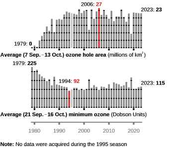 Image Source NASA.
Yes, the ozone hole has stabilized because we did something about it.
The general trend seems to be this. Scientists/engineers/medicos discover a serious problem. Scientists/engineers/medicos convince politicians something needs to be done and then work feverishly to fix/avert problem. Problem is either averted or greatly reduced. A few years later, John Q Public says 'What about problem X? scientists/engineers/medico's had their knickers in a knot about this, but nothing happened. They are such scaremongers!"
Sheesh!
Labels: global warming sillyness, science matters
Monday, July 27, 2009
Brook vs Pilmer in The great climate debate 2009
The debate is at 6:30 pm on the 28th July at Engineering House, Bagot st, North Adelaide. Speakers have been told that they will be debating the topic: “Climate change is man made”. Speaker for the affirmative: Barry Brook. Speaker for the negative: Ian Plimer.
WHERE: 11 Bagot St, North Adelaide
$5 for members, $15 for non-members (funds raised contribute to Engineers Without Borders development projects)
RSVP: gareth.e.coffee@adelaide.edu.au
More information here.
Labels: global warming sillyness, science matters
It’s all about Science Envy
Topically, given the debate about science communication that has been happening in the wake of of “Unscientific America”, in a recent article William Dembski dives into the whole Global Warming Denialism thing [1].
Ironically, at that same time in the 1970s, scientists were concerned not that the earth was warming but that it was cooling. The scare back then was global cooling!
Unfortunately for Dr. Dembski, this is a complete myth. There was no global cooling scare in the 70’s. While this is an indication of the level of fact checking involved in the article, more important is the subtext in this article, which makes more clear than ever the real concern of the Intelligent Design movement.
And this is the naked, unadulterated envy (and fear) of the power of scientists.
Holdren nevertheless represents the powerful new caste of scientists who have appointed themselves the guardians of humanity and the priests of a new social order. .... Their strategy is always the same: Scientists have discovered a problem that, as their models and data (often falsely) demonstrate, is on the verge of getting out of control; now, if only we do exactly as they say, we'll avoid catastrophe.
Stand in awe at the power of us scientists, we only have to use big words, show lots of data, click our fingers and politicians will um, er, well ..... ignore us actually (see also here). Until real disaster actually does strike.
Take air pollution: Scientists had been pointing out the issues with air pollution for years, but nothing really started getting underway until the killer smogs hit London. With acid rain, it was only after large swaths of forests began dying and lakes became sterile did anybody actually take action on scientists warnings. Collapsing fisheries? Scientists keep on warning about the consequences of overfishing but people tend to take notice only after a fishery has collapsed, and then don’t even put in decent fishing controls. Ozone hole? Despite well researched chemistry no one really listened until the ozone hole appeared over the Antarctic, then they
The true pattern is that scientists find an important issue, back it up with careful research, and have to fight persistently to get governments, businesses and the general public to take notice. Global warming is a case in point.
Now the scientific priesthood is telling us that the earth faces catastrophe if we don't mend our carbon-emitting ways and do everything we can to prevent global warming ("cap and trade" is only the beginning). .... In any case, the pattern is always the same: Find a problem, catastrophize it and make scientists the saviors.
According to George Marshal (New Scientist, 25 July 2009, page 24), it has taken 44 years of research that cost around $3 billion dollars per year, plus symposia conferences, journal articles, popular articles, documentaries and innumerable internet postings to ahh, convince politicians to come together and procrastinate. And still 40% of the UK population and over 50% of the US populations do not accept that human greenhouse gas emissions are changing the climate WWMAKD [2].
Yeah, scientists, feel our power, tremble at our might (that was sarcasm, by the way).
Even this weak, pathetic shadow of power that we do have provokes Dr. Dembski.
But isn't science our best, most reliable form of knowledge, and shouldn't we therefore defer to scientists?
Scientists are as fallible as the rest of us, as are their scientific theories. Indeed, the history of science is filled with failed scientific theories that once were confidently asserted and now have been radically modified or even abandoned
Yeah, naughty, naughty scientists; actually paying attention to evidence and modifying our theories in the light of actual data.
When John Snow closed down the Broad Street Pump the Germ theory of Disease was only just being devised. It would be significantly changed and revised multiple times before being properly formulated by Koch, and would keep on being revised multiple times since then (viruses and prions being new additions to the fold). Despite the deficiencies of the germ theory at the time, Snows actions lead to sewage and clean water works that would save millions from disease, Lister’s work would revolutionise surgery, and Koch would revolutionise medicine.
Should we have not put in sewerage works or ignored antiseptics until the germ theory of disease was in its modern form?
Science is not perfect by any means, but if you want practical solutions to practical problems it is the only way to go.
In claiming to find and then resolve problems that threaten to overwhelm humanity, they have invaded the political scene, commanding vast research moneys and attempting to force on the wider population government-sanctioned programs for social control.
Scientists, fear us, we will take your children and feed them the best available knowledge.
Of course science invades the political scene, if we want to reduce childhood deaths, prevent the spread of hepatitis C (let alone AIDS), respond to the spread of H1N1 (the flu formerly known as swine flu), slow the rise of antibacterial resistance by limiting antibiotic use in animal husbandry, make informed decisions on genetically modified foods, do anything which requires an evidence base, it will of course require science by its very nature (and involve politics because these things all involve governments at various levels).
An example is the response to HIV in Australia. The advent of HIV/AIDS in Australia resulted in an academic-grass roots collaboration which amongst other things brought about the execrable “Death goes bowling” ad (but this played a huge role in raising AIDS awareness), testing of blood donations to prevent HIV contamination of blood stocks, the “If it’s not on it’s not on” campaign, where giant condoms were plastered across buses and trams, needle exchange programs and safe needle disposal containers in public toilets.
This is exactly the sort of thing where science invades the political sphere, where we want it to invade the political sphere, and I have no doubt the Australian approach would have given Dr. Dembski a conniption fit. Certainly our approach was vigorously opposed by conservative politicians in the US. What are the results of this horrible, materialist, evidence based approach? Australia has a AIDS incidence of 0.9 per 100,000 population, over 10 times lower than that in the United States (12.8 per 100,000). And the last time I looked, Australia wasn’t markedly more decadent that the US. How dare we scientists save lives without corrupting youth!
Seriously, what does Dembski think we should do when forming policies, consult sheep entrails? The whole article reeks of fear and envy of scientists.
And the "vast research moneys"? The US military budget for 2006 was $527 billion, the NIH was around $30 billion and the National Science Foundation was around $6 billion in 2006, of which only $4 billion goes for research (2006 data as it was the only comparable data I could find at short notice). That may sound a lot, but the US had roughly 1.2 million researchers in 2006, so that money has to be spread over a lot of programs, from computing to polar science. The average NSF grant size is $140,000 which covers research costs, salaries, on costs etc.
We pay our soccer players more. Heck, to put this in perspective, Melbourne just spent $240,000 on a new logo. Vast research moneys? Ha!
Now some large collaborative projects will be funded to well over a million dollars (Large Hadron Collider or Human Genome project anyone?). But again, in terms of global warming, this goes for things like researchers salaries to actually do work, satellite data costs, sending out boats and so on to collect data, sample collection, preparation and analysis and computer time for data reduction. While this may be more money than Dembski will ever see as a philosopher, this is because scientists actually do stuff. Somebody actually has to go and drill ice cores then count the ice layers and extract gases and measure their CO2 content.
Insofar as they are trying to influence the public square, they need to explain themselves in plain English and they need to allow fair discussion and open dissent. Plenty of qualified scientists dispute that humans are significantly contributing to global warming or that extreme counter-measures are necessary. But the scientific priesthood quashes all such dissent, marginalizing and even persecuting those who don’t toe the party line.
Ohhh, Scientists use big words! Scary! Dembski also trots out the “lots of scientists dissent” myth and the “big science quashes debate” myth. Bjørn Lomborg has such a hard time getting heard, I should be so persecuted. Here in Australia, any Global Warming Denier gets a free ride in the national newspaper The Australian, no matter how loony, but real climate scientists are ignored. How’s that for power?
In reality, scientists would be chuffed if we had a thousandth of the power that Dembski ascribes to us. Any gains we make in any area of public policy, from global warming, to safe limits for pollutants, to effective public health practices, is a hard slog which first involves lots of hard data, and then convincing people at various levels in Government and Industry that things are serious. Long hard slogs, always starting with the evidence. And, in most cases, both government and Industry and other stakeholders are sympathetic.
Scientists are not our masters. They are our servants, and they need a lesson in humility. It is up to us -- We the People -- to hold their feet to the fire.
Another power fantasy from Dembski.
Despite the vast overrating of scientists power by Dembski, scientists can influence policy, because we have evidence. And this is what Dembski envies and fears.
[1] Yes, global warming is real, and largely due to human actions, deal with it. Good backgrounds at http://www.realclimate.org/ and Bave New Climate http://bravenewclimate.com/
Major issues comprehensively covered at http://scienceblogs.com/illconsidered/2008/07/how_to_talk_to_a_sceptic.php See also New Scientists Climate Change a Guide for the Perplexed and Climate Change myths.
See also this disturing report on global sea ice levels.
[2] WWMAKD What would Mooney and Kirshenbaum do. Chris and Sheril claim we scientists need to get out and communicate more. However, despite innumerable public talks, freely available websites, IPCC downloadable reports, debates, documentaries, newspaper and magazine articles it's hard to see what scientists could do to make the science of climate change simpler and easier to understand. For example, tomorrow Professor Barry Brook, the Director of Climate Science at The Environment Institute, University of Adelaide, will debate Climate Change Denier Ian Pilmer. Barry has has published two books and regularly writes opinion pieces and popular articles for the media as well as talking to a variety of community groups (I've heard him talk, he's great!). Yet ignorance on the topic abounds. What more can he do? Suggestions Chris and Sheril please.
Labels: global warming sillyness, Intelligent design
Tuesday, January 13, 2009
Jon Jenkins writes a letter...
Jon Jenkins turned up the the comments to Deltoids thread on this subject (his comments start here). Sadly, he completely missed the point (and I missed the chance to make a useful contribution).
*Yeah, he's fed up with being called names. You should see what I have been called by creationists, HIV/AIDS deniers and various other anti-rationalists. I think I win the title for "most swear words used as an adjective before my name". Somethines I get grumpy, but I have never used untruths or accused honest people of fraud to try and make my case against the anti-rationalists.
Labels: Climate Change, global warming sillyness
Friday, January 09, 2009
What's Up with Polynomial Fits (yes, it has astronomy content)
 A reader has wondered why I was so down on polynomial fits in my post on the Australians War Against Science*. Polynomial fits have their place, but to give you an idea of why polynomial fits are a Bad Thing (tm) in climate (or a wide range of) data, without extensive mathematical explanations, have a look at the graph to the left (click to enlarge).
The raw data, on casual observation, is a bit noisy, but appears to plateau then fall in the final observations.

The polynomial fit is the green curvy line (I've used a 5th order fit here, as the graph in the Jon Jenkins article used a 5th order polynomial). It sort of wobbles up and down a bit, then does a spectacular dive at the end, just like in the Jenkins graph).
A pretty good estimation of the trend eh? No. The data is actually a continuously increasing line to which I have added noise. The scale of the graph and the range of noise variation was chosen to match the UAH tropospheric temperature data. The "trend" given by the polynomial is dead wrong. The linear fit (black straight line) recovers the real line out of the noise pretty well.
The polynomial fit is quite sensitive to the final data points in a series, it just needs a bit of noise to send the curve flailing around like a snapped hawser. And climate data is very noisy, that's why scientists study long term trends, where the noise can be averaged out. Also, as we are coming off a La Nina event, we expect there to be a drop in global temperatures, it's what La Ninas do. To use a polynomial fit of truncated data when you know there is more data and you know we are coming out of a La Nina event is either sheer stupidity or culpable fraud.
This is why you don't use polynomials fits in these circumstances, they will either be misleading or completely wrong. Have a look at the second graph, it a graph of stellar intensity. The black line is the polynomial fit. Now, if someone told you that the polynomial "trend" meant that the star would soon fade away, would you accept that?
Espeically if you knew it was a truncated section of the intensity graph of Algol? That's the sort of thing Jenkins is trying to get away with.
* They are at it again today, with a headline "Obesity Epidemic a Myth", which grossly distorts the actual science. I'll rant about that later (our kids are nolonger getting exponentially fatter, they are still some of the fattest kids in the world though).
Labels: Climate Change, global warming sillyness, variable star
Wednesday, January 07, 2009
The Australians War on Science Keeps on Rolling.
 Tim Lambert has been keeping a tab on the Australian's war on Science, counting up the number of erroneous or misleading articles on science (mostly about global warming). He's up to Number XXX, but he will have to change it to XXXI with an article from January 6 by Jon Jenkins, "The Warmaholics Fantasy".
Now, Jenkins is an Adjunct Professor of Virology, specialising in computer modelling. Why is it that the Australian never gets actual climate scientists to comment?
 Heck, I'm a Senior Lecturer in Pharmacology, and I do a lot of computer modelling (okay, so its molecular modelling), why do they never invite me to comment? (insert pout here). Professor Jenkins opens with a standard litany of denialist taking points, satellites more reliable than ground based temperature recording (it's not), and that the "hockey stick" graph is fraudulent (it isn't). Professor Jenkins should be a little more careful with his accusation of fraud though. In his article he says "They [the satellite measurements] show minuscule warming, all in the northern hemisphere, which not only stopped in 2000 but had completely reversed by 2008 (see graph)."
Now the graph is not in the online version so I have taken the liberty of reproducing the graph under fair comment rules (its the graph at the top, click on the image to enlarge it, the Australian seems to have pinched it anyway). The data is from the UAH MSU global monthly lower troposphere temperature data set. You can down load it yourself and graph it. Just like I did, the result is in the bottom image (again, click on the image to enlarge it). You can compare my graph with the image accompanying Professor Jenkins article.
One of the first things you can see is that the Australian graph finishes just a wee bit early. Now I don't know if Professor Jenkins prepared the graph (it appears to be redrawn from an illustration in a US newspaper article published in October, whoever did the redrawing was being a bit naughty in producing misleading attributions), but he references it, and should have checked it for accuracy and completeness. Because the data set he uses finished in August, missing out the September, October and November data. If you include that data, the temperature anomaly bounces right back, regaining the supposed "wiped out" warming. Now the November data were there way back in December, so there is no excuse for showing a truncated graph. Professor Jenkins may not have produced this misleading graph, but he should have checked it (finding the original data wasn't hard).
The "trendline" shown in the Australians graph isn't strictly speaking a trendline, it's just a high order polynomial fit, which will generate a nice looking smooth line but will not actually reflect the trend of the underlying data. It's rather naughty to use polynomial fits in these sorts of situations. Again, Professor Jenkins appears not to have produced the fit, but he should have known immediately that this sort of polynomial fit is inappropriate. In my graph I show both a linear fit (black line) and a rolling 3 year average fit (red line). Both more appropriate models for this sort of noisy data. As you can see, global warming has not gone away. As well the UAH data agrees with the other satellite data and the two land based data systems in showing that warming hasn't stopped. Indeed the UAH data shows a warming of 0.14 degrees C per decade, comparable to the 0.16 degrees per decade found by surface stations (the RSS satellite data finds warming of 0.18 degrees C).
The dip in 2008 was caused by a La Nina event, and is not surprising at all. See also here and here for more discussion of 2008 temperature trends.
Professor Jenkins goes on at length about a whole range of other issues in climate change, but it won't surprise you that he is wrong about them too (eg Volcanoes as CO2 generators). Ironically, this piece was published the day before the Quadrant Hoax hit the Australian headlines. You think the editors might have done a little fact checking too.
But, Professor Jenkins the bottom line is you shouldn't be too quick to accuse scientists of fraud when you can't be bothered to check out the datasets and draw your own graphs (and do your own modelling).
UPDATE: Tim Lambert blogs the Jenkins article here. Also, Jenkins has in his article the statement "Science is only about certainty and facts." It is not, it is about inference to the best explanation. But again, the irony of bringing up certainty when Jenkins hasn't done his fact checking is palpable.
Labels: global warming sillyness
Tuesday, July 15, 2008
The Advertiser's War on Science
 One of the things I'm passionate about is science communication. Understanding science, and its tools and methods, are critical for citizens to make informed decisions on issues from gene-modified foods to global warming. The need to understand and communicate science is highlighted by a recent column by Chris Kerry, of my local paper the Advertiser. In it he claims that global warming ended in 1998. Unfortunately, it hasn’t (see the graphs here and scroll down), but to understand why you need to know something about statistics.
First, let me reacquaint you with the Arrhenius equation, this says, for a given input of radiation, if you add more carbon dioxide to an atmosphere, it will warm up in a predictable manner. It’s standard physics, and you can readily calculate how much warmer the earth will get given the amounts of carbon dioxide we are injecting into the atmosphere. But why, you say, if this is simple physics, don’t we see a smooth rise in global temperatures? Because the climate record is noisy.

Superimposed on the CO2 induced rise in temperature is noisy from a wide variety of sources, dust from volcanoes, heat shifts in the ocean from El Nino and La Nina events and a whole host so other sources. These effects put wobbles in the line that may be misleading if we don’t understand what is going on.
Have a look at the graph at the top left above, it looks like the graph starts off flat, rises somewhat then flattens out. Much like the graph Kerry refers to in his column.
But the illustration is in fact a relentlessly rising line. I have merely added some noise to it (for the technically minded I used RAND()*(-0.5-0.5)+0.5 to add random numbers ranging between -0.5 and 0.5 to the dataset). The graph below it shows the actual line that underlies the noisy data.
The graph below that again shows the actual temperature record from GIS TEMP,, how do we extract the underlying trend? What you don’t do is look at the last few data points. If you took the last 5 data points of my graph and look at the trend, it comes out nearly flat, yet we know that the curve is rising, you need to sample more pints to get a clear feel for the trend. In global warming data, you need to sample between 10-15 years to see the underlying trend, and that trend is relentlessly upwards.
So, no, global warming did not stop in 1998 and global temperatures have not dropped since 1998.
See also Did Global Warming Stop in 1998?, Global Trends and ENSO , and Wiggles. You may also find these links helpful. Global climate and the El Nino phenomenon. Doubts about the advent of spring.
Labels: global warming sillyness, science matters
Wednesday, April 18, 2007
Archbishop Pell and Global Warming - not a pretty sight
We have been subjected to a lot of nonsense about climate disasters as some zealots have been painting extreme scenarios to frighten us. They claim ocean levels are about to rise spectacularly, that there could be the occasional tsunami as high as an eight story building...
Eh, what? Who has said this, certainly no climate scientist. Global sea levels will change significantly between 2040 and 2100. Just how rapid depends on whether the alarming increase in glacier movement continues and how much we can reduce our greenhouse gas emissions, but no one has claimed sea levels will rise spectacularly soon.
A local newspaper editorial’s complaint about the doomsdayers’ religious enthusiasm is unfair to mainstream Christianity. Christians don’t go against reason although we sometimes go beyond it in faith to embrace probabilities.
This statement would be a lot more plausible if the article wasn't chockablock with denialist nonsense. I mean, take this
Neither should it be too surprising to learn that the media during the last 100 years has alternated between promoting fears of a coming Ice Age and fear of global warming!
This takes the myth that scientists believed in a new ice age being around the corner, and makes it even more mythical! Now its the media that have been promoting global warming/cooling (what? alternately?) for a 100 years! Where did this nonsense come from?
Did the Archbishop even talk to a climate scientist? How can he talk of reason with a straight face when he hypes myths to ridiculous levels?
Lots of other denialist taking points are there as well, ice levels in Antarctica (and also here), satellite temperature changes, the lot.
Over at Pharyngula and Recursivity jaws have dropped because Archbishop Pell invokes Noah's flood, (to be fair, he may be thinking of the prehistoric Black Sea flood), but really, the whole thing is such a farrago of nonsense and poor logic that it mocks his claim of not going against reason.
Again, why can't people talk to actual climate scientists before spouting nonsense.
Labels: global warming sillyness



 Click to read about or order
 Click to read about or order
 Click to read about or order
 Click to read about or order


