Tuesday, February 22, 2011
Visualizing Exoplanets Part 2
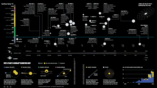
 Exoplanets visualized at "Data is Beautiful" for Wired.
I have previously pointed you at some amazing visualizations of the Kepler Exoplanet data.
My friend Stuart has just alerted me to a stunning visualization at "Data is Beautiful", showing some of the most interesting and important exoplanets. The post also shows the step by step process of taking the data and building an infographic out of it, which is in itself ineteresting. A truly amazing piece of work (and one of my posts is referenced in it) and they make the spreadsheet they used to build the exoplanet graphic available to all.
Labels: exoplanet, extrasolar planet, science communicators


 Click to read about or order
 Click to read about or order
 Click to read about or order
 Click to read about or order


